Hope, you
read my first chapter of the Silverlight Tutorial “Create Silverlight Application .Net 1”. In that post, we learned
about the very basic informations on Silverlight, it’s System Requirements,
pre-requisite to create a Silverlight application, XAP file, XAML file and
hosting a Silverlight application.
In this chapter we will first discuss on how to create a new Silverlight project and the structure of it. Later in this chapter we will discuss on UserControls and various ways of development. After reading this chapter you will be able to create a HelloSilverlight application and UserControls for your application.
In this chapter we will first discuss on how to create a new Silverlight project and the structure of it. Later in this chapter we will discuss on UserControls and various ways of development. After reading this chapter you will be able to create a HelloSilverlight application and UserControls for your application.
How to create a new Silverlight Project?
If your
development environment is ready then we can proceed towards creating a new
Silverlight Application project. At the end of this part we will be able to run
our first Silverlight application inside the browser.
1. Open your
Visual Studio 2010 IDE
2. Select
File > New Project or just press CTRL + SHIFT + N to open up the New Project
dialog
3. Expand the
“Visual C#” node and then go to sub node “Silverlight”
4. Select
“Silverlight Application” in the right pane
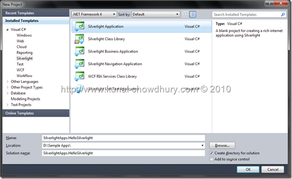
5.
Select proper location to store your application (let’s say, “D:\Sample Apps\”
6. Now enter
a proper name for your project (call it as: SilverlightApps.HelloSilverlight)
7. Select the
.Net Framework version from the combo box at the top (I am using .Net Framework
4.0 by default as I am using Visual Studio 2010) and click OK
8. In the
next dialog make sure that “Host the Silverlight application in a new Web site”
option is selected
9.
Choose “Silverlight 4” as the Silverlight Version and hit OK
Wait for a
while, Visual Studio will now create the first Silverlight solution for you to
use which will contain a Silverlight Project and one Web Application Project to
host your Silverlight application. Once done, you will see Visual Studio
already created two XAML files (App.xaml & MainPage.xaml) for you inside
the Silverlight Application project.
So for now
your first Silverlight application has been created. Press F5 to run the
application. It will open a browser Window with a blank page on that. Wow! What
happened? Nothing is there!!! Don’t worry, everything is fine. We didn’t modify
the default blank XAML page. Just right click on the browser page & you
will see the Silverlight context menu on that.
What’s the Project
Structure of Silverlight?
When you
create a new Silverlight project, Visual Studio IDE creates two different
projects for you (as you can see in the below picture). One is your main
Silverlight project and the another is a Web application project which will
host your Silverlight application (.xap file).

The main
Silverlight project (SilverlightApps.HelloSilverlight) consists of App.xaml,
App.xaml.cs, MainPage.xaml & MainPage.xaml.cs. I already discussed on those
file in depth in previous chapter. The web project
(SilverlightApps.HelloSilverlight.Web) consists of JavaScript file named
Silverlight.js which is responsible for checking the Silverlight version in
client side and also if the Silverlight plug-in is missing at the user end, it
asks to install the required runtime from Microsoft site. The .aspx & .html
pages are present in the root to host the Silverlight application. Your
Silverlight application .xap file is located under the ClientBin directory
inside the Web project.
Creating a
“HelloSilverlight” Application
Now let us
start modifying the “MainPage.xaml” by insertinga text “Hello Silverlight”. We
will add one TextBlock control inside the Grid panel with it’s text property as
“Hello Silverlight”.
But before
going to add the content inside your page let me tell you that, you can add it
in two ways: “Declarative approach in XAML” and “Programmatic approach in
Code-Behind”. In declarative approach you have to add the Silverlight controls
in the XAML page in XML format only with their properties as attributes. In
other hand, you have to create the objects of the controls programmatically and
have to set their properties.
First go with
the Declarative Approach:
1.
Open
the file “MainPage.xaml” in Visual Studio
2. Inside the Grid tag add the following texts:
2. Inside the Grid tag add the following texts:
<TextBlock x:Name="helloWorld" Text="Hello World"
FontSize="30"></TextBlock>
Your XAML page will now look like this:
<UserControl x:Class="HelloWorld.MainPage"
xmlns="http://schemas.microsoft.com/winfx/2006/xaml/presentation"
xmlns:x="http://schemas.microsoft.com/winfx/2006/xaml"
xmlns:d="http://schemas.microsoft.com/expression/blend/2008"
xmlns:mc="http://schemas.openxmlformats.org/markup-compatibility/2006"
mc:Ignorable="d"
d:DesignHeight="300" d:DesignWidth="400">
<Grid x:Name="LayoutRoot"
Background="White">
<TextBlock x:Name="helloWorld" Text="Hello World"
FontSize="30"></TextBlock>
</Grid>
</UserControl>
3. Press F5
to run your application once again. Once the browser loads your Silverlight
application you will see “Hello SilverlightFrom XAML” text appears inside the
browser window.

Now, we will
create the same from the code behind (programmatically). Assume that, we have
not added the Text inside the XAML.
1.
Open
your “MainPage.xaml.cs” using the Visual Studio
2.
There
you will find the constructor of the MainPage class. Add the following lines of
code after the call to the InitializeComponent() method:
public MainPage()
{
InitializeComponent();
TextBlock txt = new TextBlock()
{
Name = "txt",
Text = "hello silverlight from code",
FontSize = 32,
Foreground = new SolidColorBrush(Colors.Red),
HorizontalAlignment = HorizontalAlignment.Left
};
LayoutRoot.Children.Add(txt);
}
Press F5 and see the result.

Note that,
the TextBlock control has been added as a child element to the LayoutRoot panel
which is a Grid. So, the question here is, what are the panels available in
Silverlight where we can add child controls? Ok, for now just remember that
there are several content holders (panels) available to hold any child controls
like: Grid, Canvas, Border, StackPanel etc. In XAML pages the elements are
maintained in a hierarchy like the HTML pages (DOM i.e. Document Object Model).
This hierarchy allows us to nest different controls inside each other. I will
discuss on this in depth in the next chapter.
Creating a
Silverlight UserControl
In our last
example we have seen, once we created the Silverlight project, the Visual
Studio IDE has automatically created two XAML pages:
App.xaml&MainPage.xaml. If you view the MainPage.xaml in depth, you will
notice that it started with “UserControl” as the root element.
<UserControl x:Class="HelloWorld.MainPage">
</UserControl>
Also, if you
open the MainPage.xaml.cs file you will notice that the class itself inherits
from the base class “UserControl”.
public partial class MainPage : UserControl
{
public MainPage()
{
InitializeComponent();
}
}
So, what is
that UserControl? UserControls are basic unit of reusable XAML like you use in
asp.net. It is the root of your XAML and contain only one child as a control.
Though that child may contain one or more other controls but the UserControl
must have a maximum of one content control. UserControls are mainly created
using XAML and then reused in various places.
Silverlight
Tools for Visual Studio comes up with the default template for creating a basic
UserControl. Now follow the steps to create it:
1.Open your
existing Silverlight application project (for this example, you can use the
“HelloSilverlight” project just now we created)
2.Right click
on the Silverlight project “SilverlightApps.HelloSilverlight” and select Add
-> New Item
3.Select
“Silverlight UserControl” from the right panel
4.Enter a good
name (here I am using “EmployeeView”) and hit enter

Now let us
build our first UserControl to show the Employee’s FirstName, LastName&
Department inside the UserControl XAML file. How to do that? Before doing it
let us split our Grid panel into three Rows & two Columns
<Grid x:Name="LayoutRoot"
Background="White">
<Grid.RowDefinitions>
<RowDefinition/>
<RowDefinition/>
<RowDefinition/>
</Grid.RowDefinitions>
<Grid.ColumnDefinitions>
<ColumnDefinition Width="100"/>
<ColumnDefinition Width="*"/>
</Grid.ColumnDefinitions>
</Grid>
Now, lets add
the TextBlocks inside the Grid, in specific Rows and Columns. In our case the
left column will hold the “FirstName”, “LastName” and “Class” label. The second
column will hold the informations according to the labels. Here is the XAML
code for the same:
<Grid x:Name="LayoutRoot"
Background="White">
<Grid.RowDefinitions>
<RowDefinition/>
<RowDefinition/>
<RowDefinition/>
</Grid.RowDefinitions>
<Grid.ColumnDefinitions>
<ColumnDefinition Width="100"/>
<ColumnDefinition Width="*"/>
</Grid.ColumnDefinitions>
<TextBlock x:Name="labelfirstname"
Text="FirstName" Grid.Row="0" Grid.Column="0" VerticalAlignment="Center"></TextBlock>
<TextBlock x:Name="FirstName" Text="SHOEB" Grid.Row="0" Grid.Column="1"
VerticalAlignment="Center"></TextBlock>
<TextBlock x:Name="labellastname"
Text="LastName" Grid.Row="1" Grid.Column="0" VerticalAlignment="Center"></TextBlock>
<TextBlock x:Name="LastName" Text="SHAIKH" Grid.Row="1"
Grid.Column="1" VerticalAlignment="Center"></TextBlock>
<TextBlock x:Name="labelclass" Text="Class" Grid.Row="2"
Grid.Column="0" VerticalAlignment="Center"></TextBlock>
<TextBlock x:Name="class" Text="MCA" Grid.Row="2"
Grid.Column="1" VerticalAlignment="Center"></TextBlock>
</Grid>
You can see,
I am using “Grid.Row” and “Grid.Column” attributes in each TextBlock. What does
it mean? Grid.Row specifies the row number where to place the control.
Similarly, Grid.Column specifies the column number. For example, if you use
Grid.Row=”2” and Grid.Column=”4” to any element inside your Grid, the element
control will be placed in 3rd Row and 5th Column of the Grid. You can think the
Grid panel as a Matrix which has zero based index.
Our
UserControl is ready now, but before running the application we need to put it
inside the MainPage which loads at application load. You can do this in two
different ways. One is using the XAML and the another is using the Code-behind
file. In code behind it is very easy. You have to follow the same steps as we
did in previous chapter to set the “Hello Silverlight” TextBlock, but if you
want to set it in XAML you have to do a little trick for the first time. Let us
discuss on this step-by-step:
First go with
the Declarative Approach:
1. Open
the file “MainPage.xaml” in Visual Studio
2. Add the following line inside the UserControl tag of the MainPage.xaml (after any xmlns line):
2. Add the following line inside the UserControl tag of the MainPage.xaml (after any xmlns line):
xmlns:uc="clr-namespace:HelloWorld"
Here, “uc”
stands for pre-tag for specifying the namespace. You can use any name. We used
“uc” to specify “UserControl” for better readability. Now inside the Grid
control you can add the UserControl we have just created. Here is the code for
the same:
Now, your
MainPage.xaml will look like this (the bolder text I have inserted in the
XAML):
<UserControl x:Class="HelloWorld.MainPage"
xmlns="http://schemas.microsoft.com/winfx/2006/xaml/presentation"
xmlns:x="http://schemas.microsoft.com/winfx/2006/xaml"
xmlns:d="http://schemas.microsoft.com/expression/blend/2008"
xmlns:mc="http://schemas.openxmlformats.org/markup-compatibility/2006"
xmlns:uc="clr-namespace:HelloWorld"
mc:Ignorable="d"
d:DesignHeight="300" d:DesignWidth="400">
<Grid x:Name="LayoutRoot"
Background="white">
<uc:StudentView Width="300" Height="100"></uc:StudentView>
</Grid>
</UserControl>
Once you run
your application now, you will see the following view of your first UserControl
application:

Now let us
create it from Code-behind. I assume that the control we just added inside the
Grid has been removed from the XAML, that means your Grid panel has no child
inside it. Create the instance of the EmployeeViewUserControl and add it as
child to the LayoutRoot Grid:
StudentView student = new StudentView {Width=300,Height=100 };
LayoutRoot.Children.Add(student);
Run your
application and you will see the same output. The second approach is easy, am I
right? Yup, for the first application it looks very easy enough. But when you
write complex applications you will notice that the first approach is easier
than the later. Why? Because, you will get more control over the design. You
can see the output immediately in the preview sceen, also you can drag the
control to position it properly in the panel. In some cases you will find it
useful from code. Depending upon your business need you have to decide
where to create and add your UserControl.
Is it
confusing? No, when you are sure that you have to dynamically load no. of
UserControls based on your data you have to create and load it from the code
behind. For the other cases, it will be easier to write inside the XAML.
Remember
that, you can create as many instances of your UserControl and place it inside
your XAML page. Once we discuss on the different types of panel and layout in
next chapter you can get better visibility to that.
No comments:
Post a Comment